 Skip to content
We’ve refined our visual identity to better reflect who we are and how we work. The changes create clearer distinctions between our services whilst maintaining a unified brand presence.
This wasn’t about a design refresh or following the latest design trends; it was about solving a problem that had become impossible to ignore.
DNA IT Solutions has grown significantly. Three distinct service areas, each with its own complexity, each serving different client needs. Our old branding couldn’t handle this structure. Everything looked the same, whether we were discussing cloud infrastructure or security operations.
The solution required more than a new logo. We needed a system.
How the new identity works
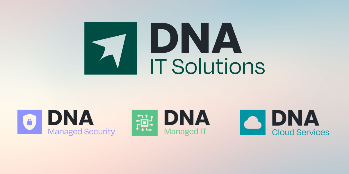
We now have two logo types. The main DNA IT Solutions logo represents the company as a whole; you’ll see it on our website, in general communications, on business cards. Service logos appear only in materials specific to that service. If you receive a Managed Security proposal, it carries the purple shield logo. A Cloud Services presentation uses the aqua cloud logo. Managed IT materials display the green network icon.
This distinction matters when you’re deep in technical documentation or comparing different service offerings. The visual cue tells you immediately which domain you’re in.
The colour system follows the same logic. Our primary palette gives us Deep Charcoal as the foundation, with Deep Green and Emerald Green providing our core brand colours. These appear across everything we do. Then each service has its own secondary colour: purple for Managed Security, green for Managed IT, aqua for Cloud Services.
Open a security assessment report and you’ll see purple accents throughout. That same purple appears in security-focused social media posts, event materials, technical guides. The consistency creates recognition; over time, you’ll associate purple with our security practice before you read any text.
Typography anchors the system. Degular Semibold handles all headings and subheadings, giving us a distinctive voice across every touchpoint. Poppins Light serves as our body typeface, chosen specifically for clarity in technical documentation. These
What you’ll notice
These changes will roll out gradually across all customer-facing materials over the next quarter. Proposals will arrive with the new service logos. Our website and socials reflect the updated colour system. Email signatures, technical documentation, quarterly business reviews; everything will shift to the new identity.
You’ll see the main DNA IT Solutions logo on general communications, the service logos on specialist materials. Colour coding will become familiar quickly. Within a month, you’ll instinctively recognise which service area a document relates to before you process the content.
The fundamentals haven’t changed. You get the same great technical expertise and support commitment. We’ve simply created a visual language that matches how we actually work and how you actually engage with us.
This identity was built to scale. As we expand capabilities and add services, the system accommodates growth without losing coherence. That’s the difference between a logo and an identity system; one is decoration, the other is infrastructure.
What are your thoughts on our new identity?